Webfonts and layout shifting
In this article, I’ll outline why and how I matched my fallback font’s dimensions with my webfont’s settings to diminish the layout shifting.
If you don’t want to read my ramblings, you should skip to the TL;DR
Preamble
In my quest for the coveted “four-hundos”, aka. a perfect Lighthouse score, I’ve always ended up studying and fixing arcane issues I’ve never encountered before. This time around, I scored an abominable 95/100 for performance. The issue was the teeny-tiny amount of CLS, cumulative layout shift.
In my case, the layout shift was caused by my webfont, Vollkorn. When using webfonts, fonts that are not included in the user’s OS or device by default, you’ll encounter what’s called either FOUT or FOIT depending on how font-display is configured.
FOUT & FOIT
FOUT stands for Flash of Unstyled Text and FOIT means Flash of Invisible Text. So, either the user is briefly show the content in a fallback font the user has or the text will be entirely invisible until the webfont has loaded. Neither is ideal, but with FOUT, the time to interactive is shorter, which is always better.
If neither temporarily unstyled or invisible text are viable options, the third option would be use font-display optional. This would mean that the browser will use the font only if the user already has the font when drawing the view. So, if the user has the font installed or cached, it’ll get used and otherwise it’ll just default to the fallback font. During the first page load, users will see the text in the fallback font and when they reload or navigate to another page on the site, the webfont will have downloaded and that will get used instead of the fallback.
I’m not a fan of optional, I would rather just use the system font stack instead of having the first pageload in a completely different font from the rest of the pages.
Not all fonts are equal
I had set Vollkorn as the main body typeface and serif as the fallback with the font-display swap option. It should default to Times New Roman on most devices and after the browser has downloaded Vollkorn, it’ll replace Times New Roman with Vollkorn. Users on my page would have a brief moment of FOUT.
My issue specifically stemmed from the fact that 16pt in one font doesn’t equal 16pt in another font. Space between letters and words in two fonts can be different, letters can have a different width as well as the ascenders and descenders can vary in size. A whole lot of variables.

Before Vollkorn is loaded and displayed, the page is laid out with Times New Roman and they reserve a different amount of space on the screen. One font might occupy two lines whereas the other font could fit in just one. When swapping between the fonts, the content jumps.
We need to match our webfont and fallback font so that they occupy roughly the same space on the page.
The solution
After sifting through the web.dev articles on CLS, Adam helpfully directed me to this article on Smashing Magazine by Barry Pollard. The article is more in-depth than anything I could ever write, it’s definitely worth a read!
In the article, Barry links to two resources that eventually helped me solve my issues! The first one is Font style matcher by Monica Dinculescu and Automatic font matching by Malte Ubl.
If the webfont in question is on Google Fonts, Malte’s tool will automatically give you a fallback font-face CSS rule with the size-adjust, ascent-override and fallback font set.
In the case that the font isn’t available on Google Fonts, Monica’s tool comes in handy as it’s relatively easy to eyeball the dimensions with it.

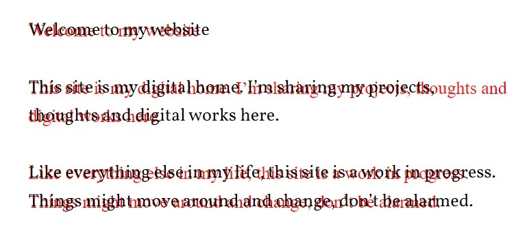
As illustrated in the picture above, it’s not perfect even with the corrections applied. We can see that the second paragraph isn’t perfectly aligned and with longer bouts of text, the content will still jump. It’s still infinitely better than the alternative of not matching the fonts.
My font configuration looks roughly like this
@font-face {
  font-family: "Vollkorn";
  src: url("/fonts/vollkorn.woff2");
  font-weight: 400 900;
  font-display: swap;
}

@font-face {
  font-family: "serif-fallback";
  size-adjust: 108.28%;
  ascent-override: 103%;
  src: local("Times New Roman");
}

body {
  font-family: "Vollkorn", "serif-fallback";
}
With these fixes, we have a solid 100 for performance on Lighthouse!
TL;DR
Use Font style matcher or Automatic font matching to match your fallback font’s sizing settings with your webfont. Create a font-face rule for the fallback with the settings applied and set your fallback font as an explicit fallback for your webfont.
Finishing words
Fonts are hard. You can always dig deeper and learn new things about them. At the same time, that’s also why it’s so rewarding to spend a day or two to squash out the bugs and squeeze out every last bit of performance. Earlier, I wrote an article on subsetting fonts, which I recommend checking out!
If this post resonated with you or helped you out in any fashion, please tell me on Mastodon! Thank you so much for reading this far!